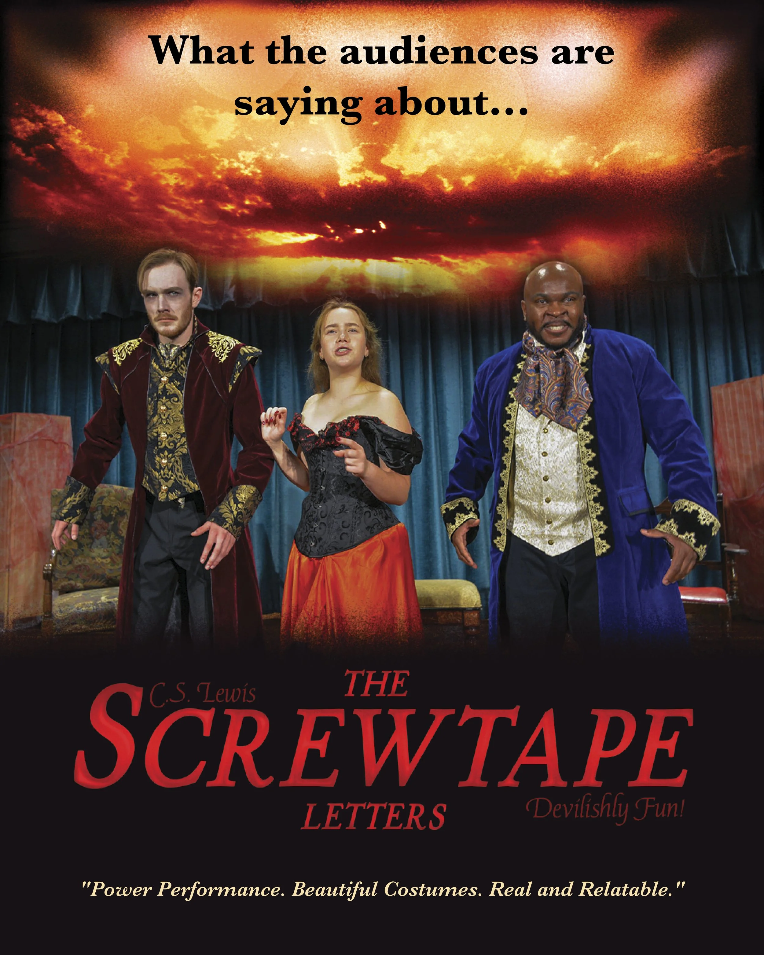
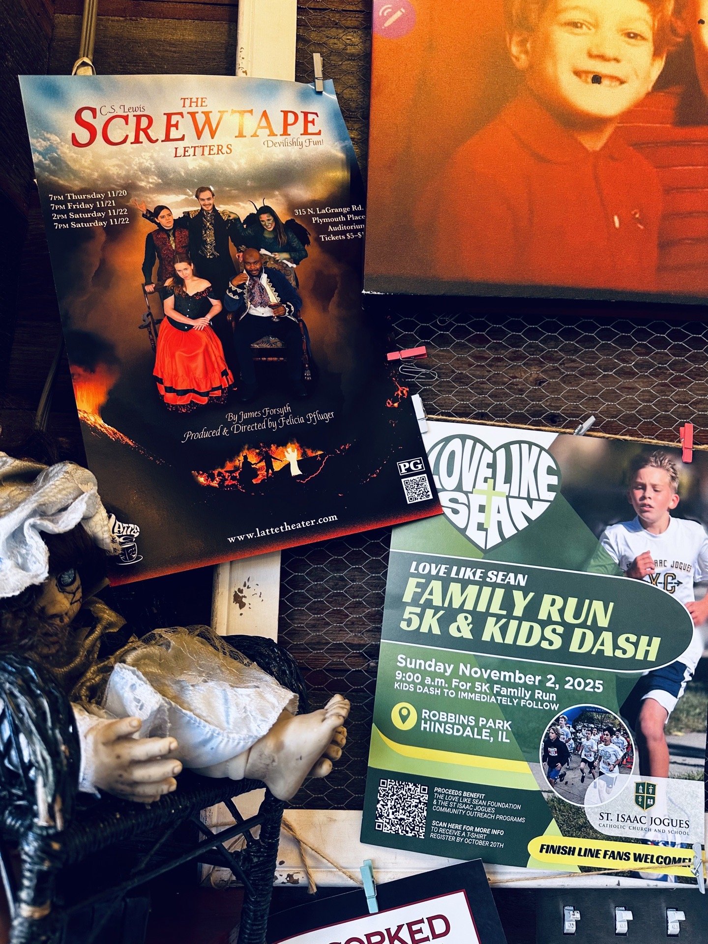
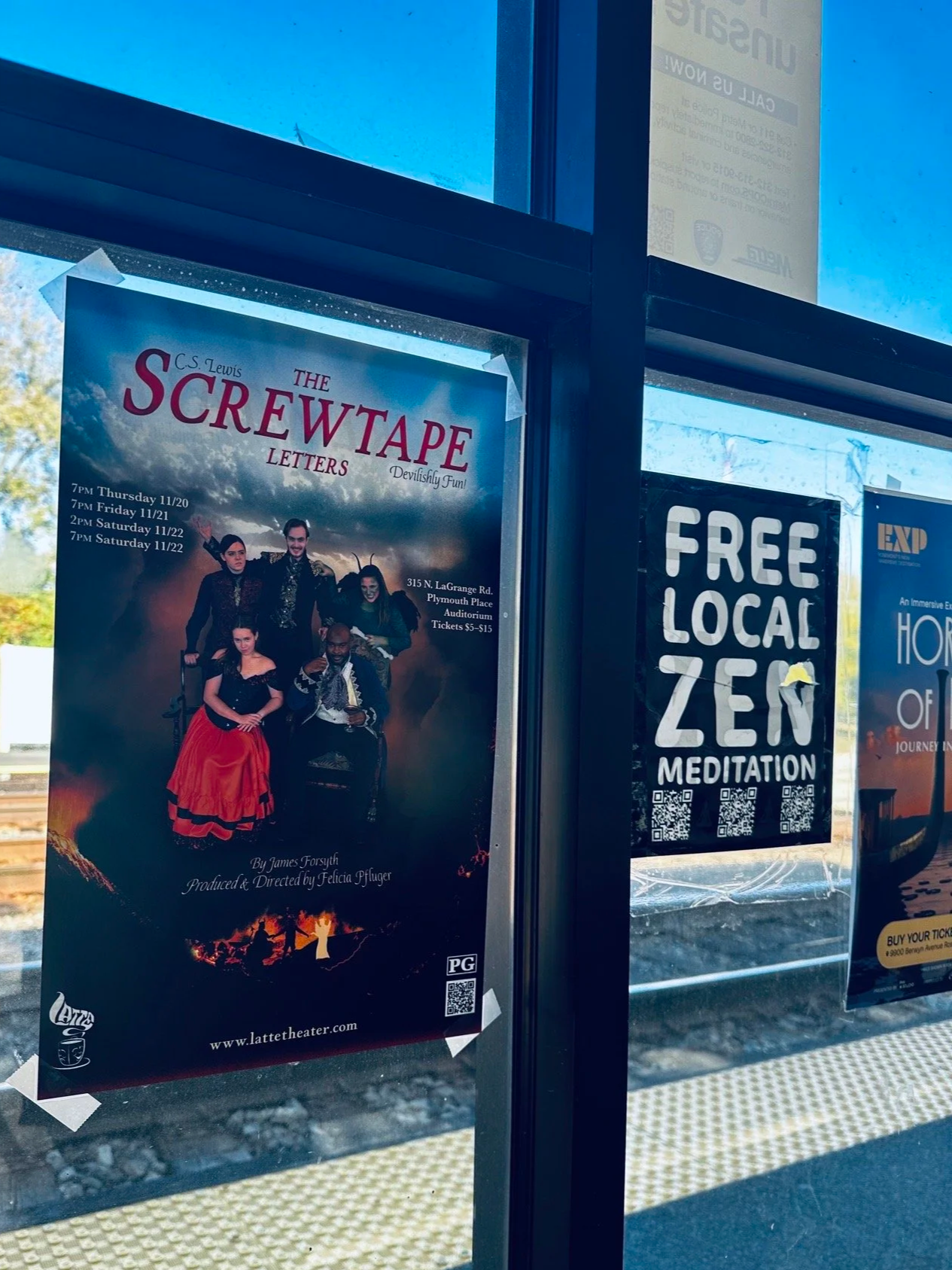
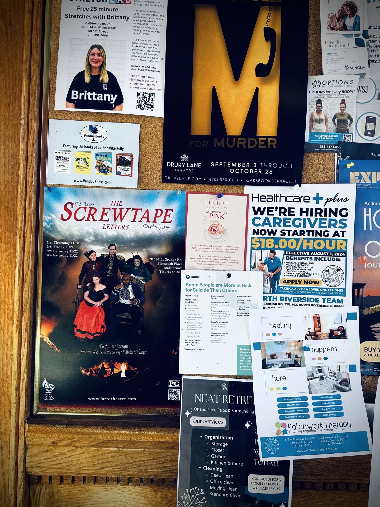
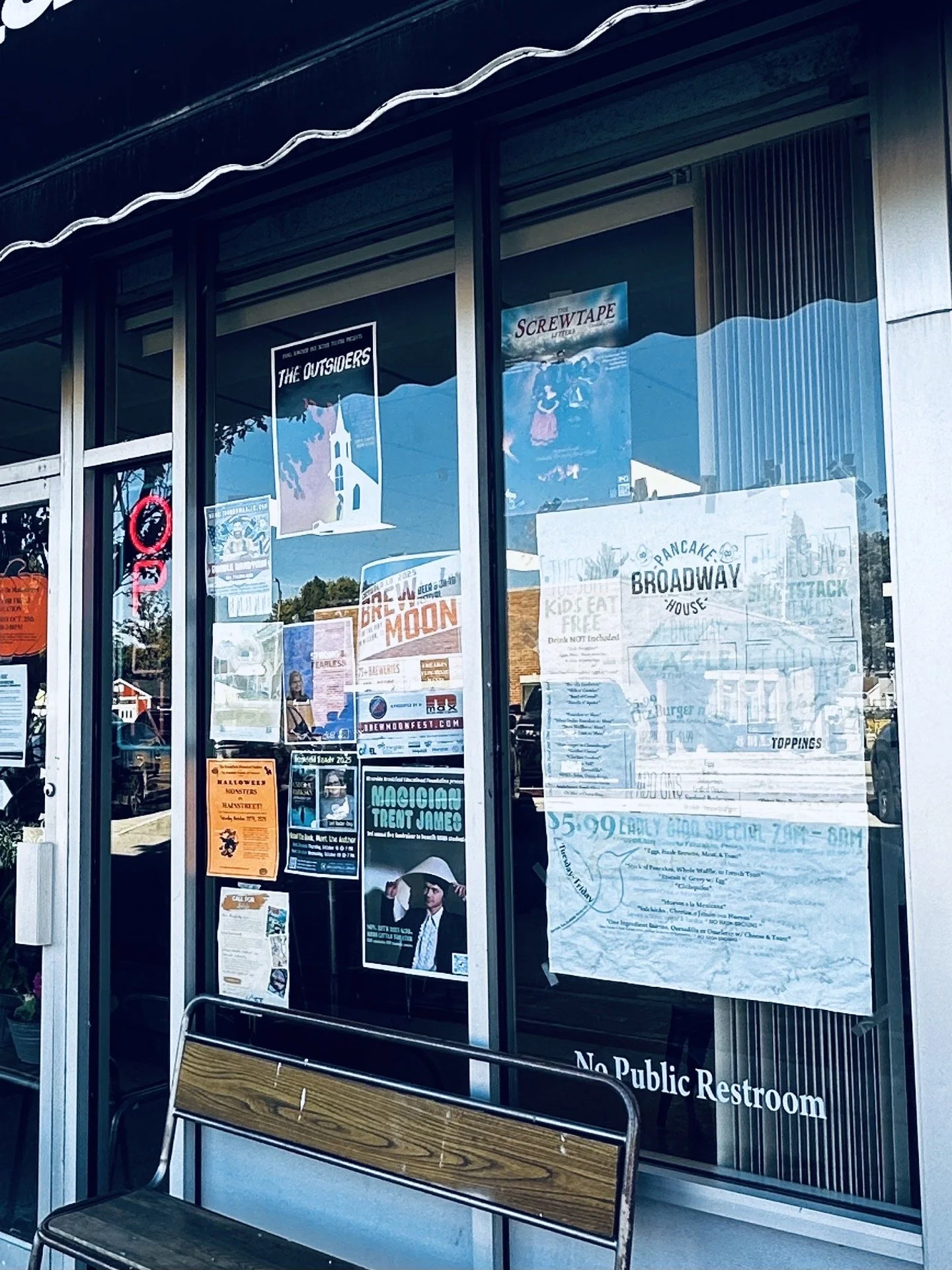
THE SCREWTAPE LETTERS
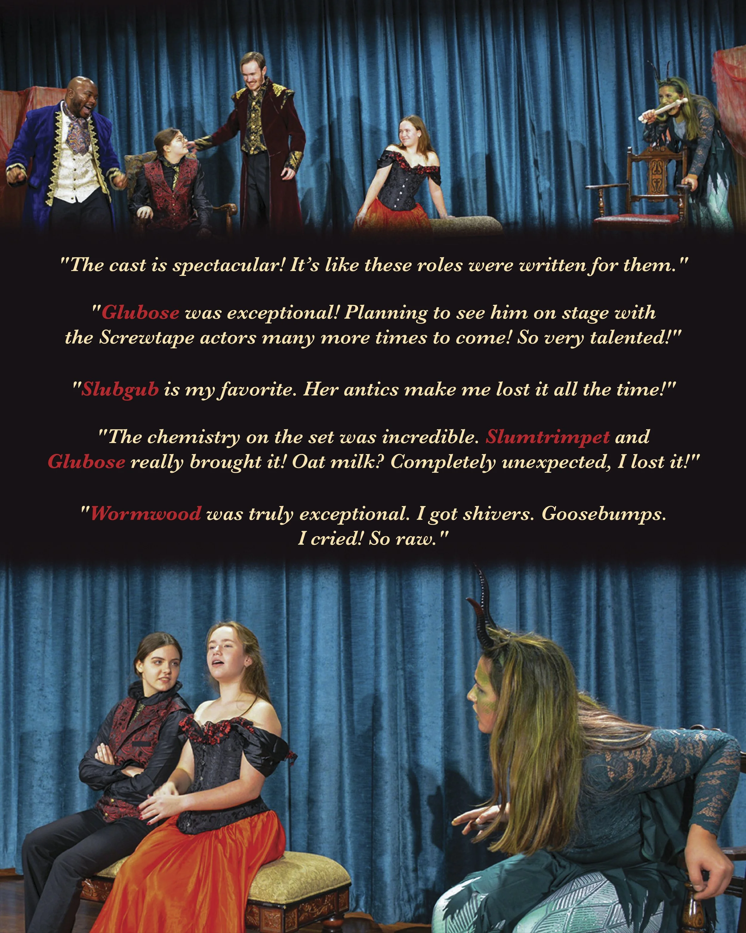
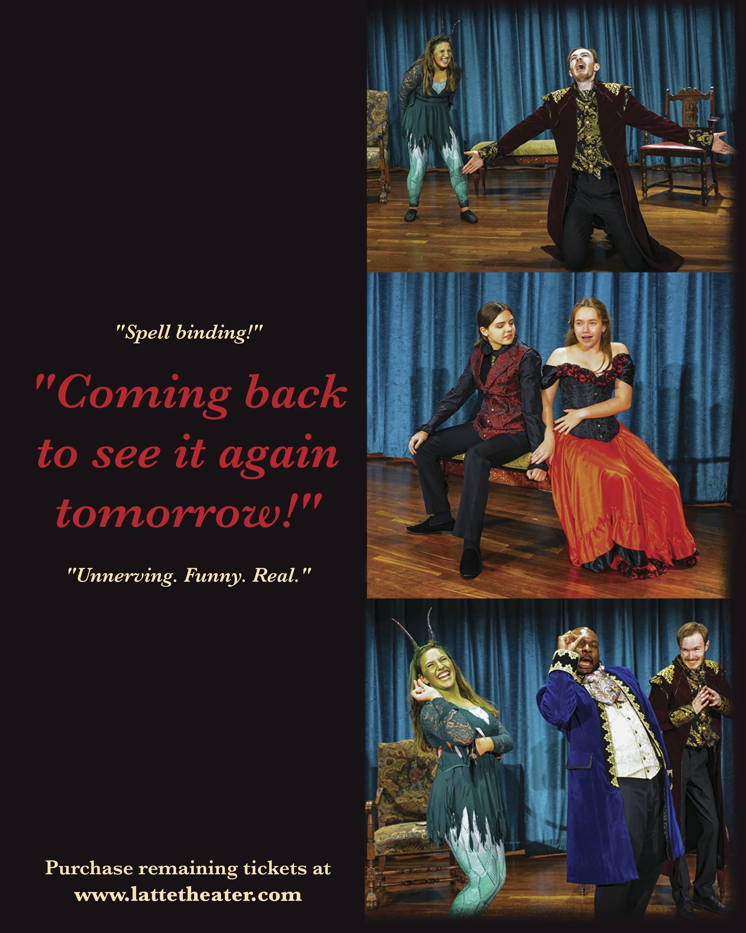
When I met with Felicia, the show’s director, we discussed what her theater had done in the past to market shows and create a captivating poster to draw the audience in. Our conversation touched on incorporating all of the cast members into the poster and giving them their well-deserved moments in the spotlight.
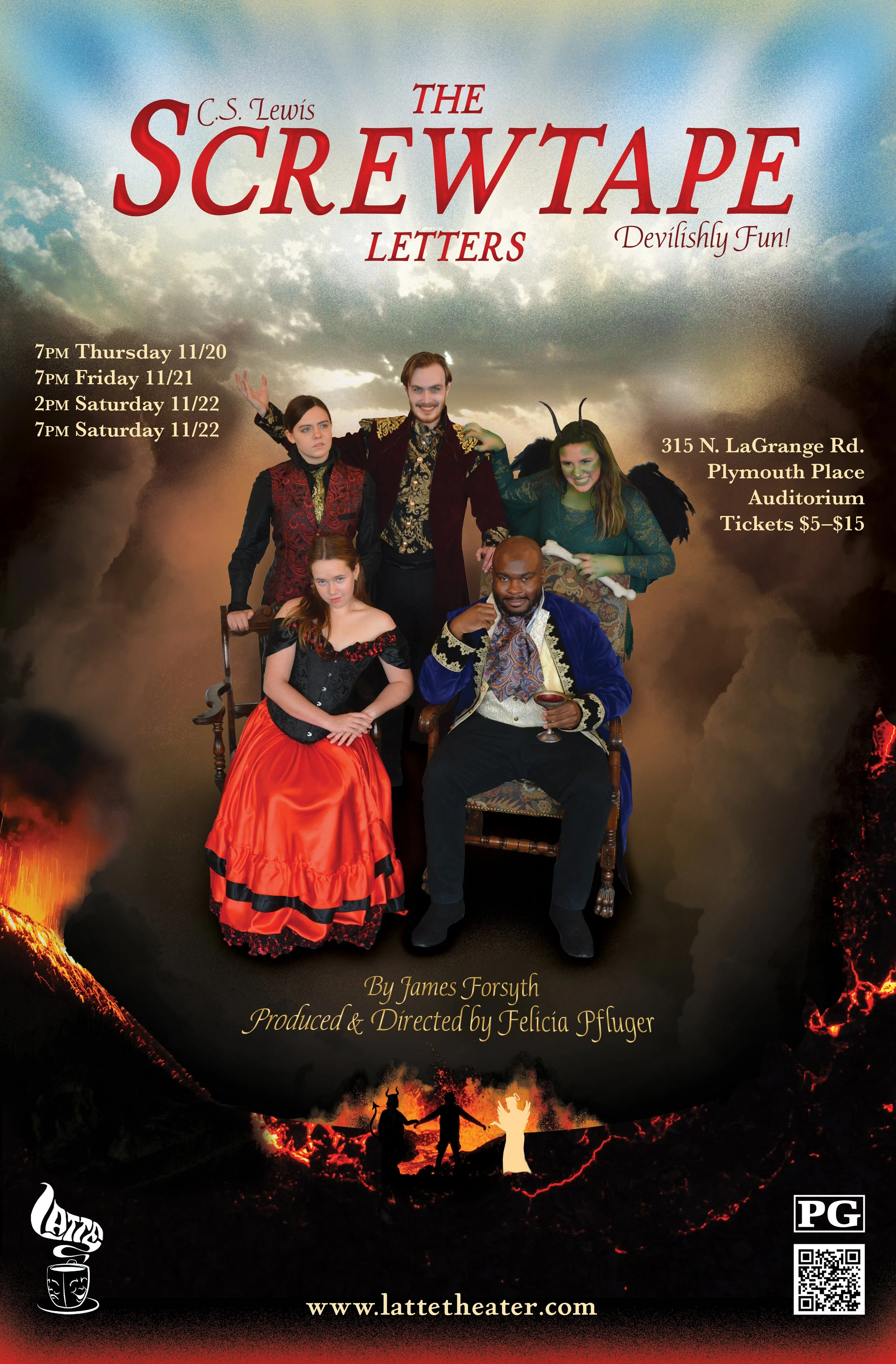
Show Poster
Visual wishlist:
An Italian feel (like an oil painting)
Warm sepia tonalities, darker cloud frame
Bold red title
Angelic body of light from the top, light gold with a kiss of light blue
Gilded typography
Rising fire and hellscape along the bottom
Devil, human, angel figures in hellscape
Play up Slubgub’s green skin and costume
Red (a cloak of fabric) around the characters
Supporting information
(dates, location, QR code, website, etc.)
Building this poster was a fun combination of creating a digital collage from different photos, blending the background, and adding color details with brushes to the clouds, hellscape, typography, and characters (Slubgub). We scrapped the idea of a red element behind the cast to avoid visual clutter and readability issues.
This design was displayed in over 200 businesses in the local area and included on the cast/crew t-shirts!
Social Media
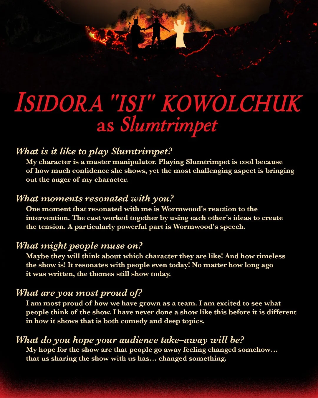
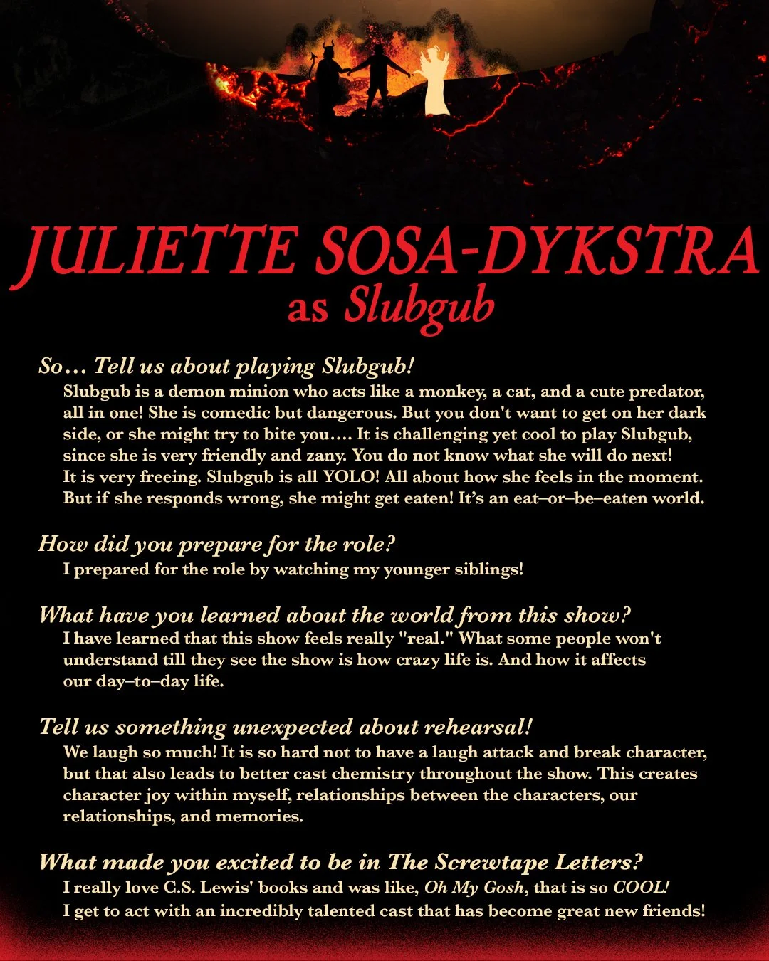
Following the release of the poster, I began creating designs to showcase the talented cast of The Screwtape Letters. Each cast member was given their moment to (digitally) shine with their professional headshot photos, personal biographies, and answers to press questions. I narrowed the focus of the designs to incorporate the hellscape element from the poster, highlighting the actors’ portrayals of their demon characters. For the biographies, the setting is the hellscape, while the press questions include a further “descent” into the ground, mirroring a deeper insight into the show.

Glubose Biography
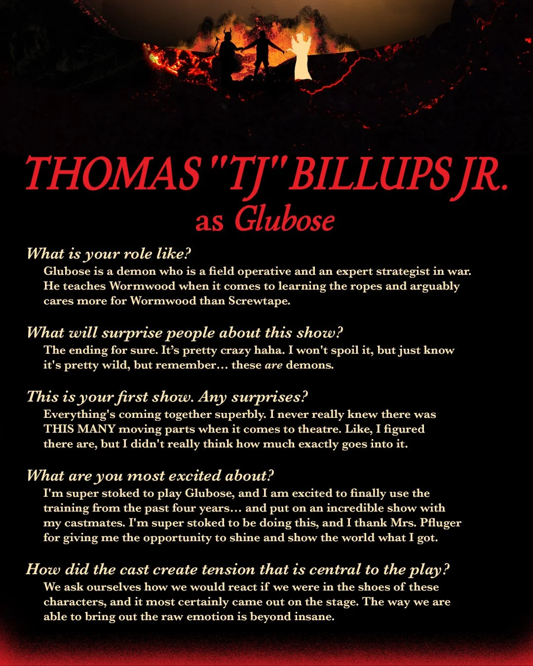
Glubose Press
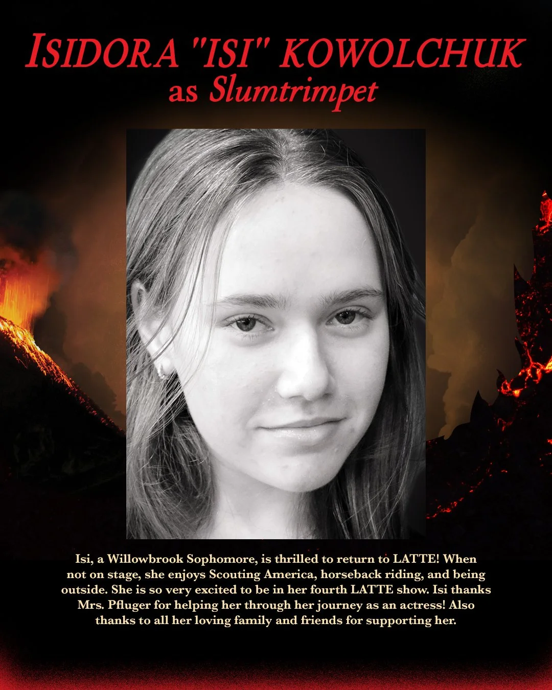
Slumtrimpet Biography
Slumtrimpet Press

Wormwood Biography
Wormwood Press
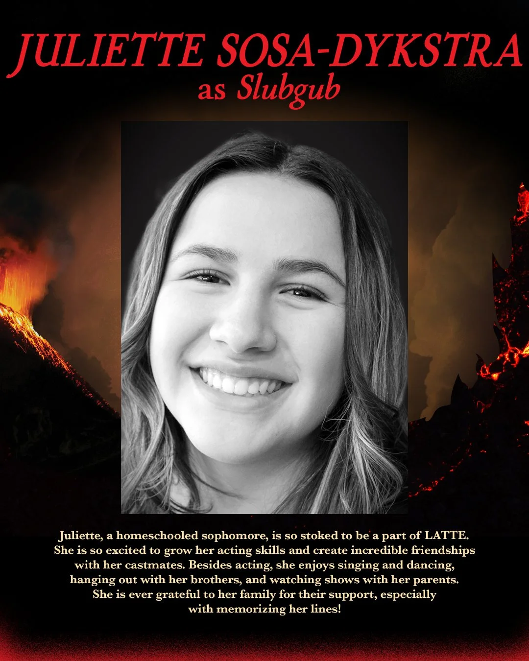
Slubgub Press
Slubgub Press

Screwtape Biography
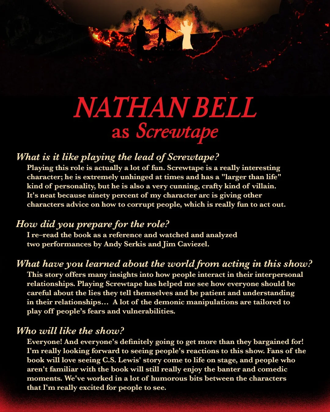
Screwtape Press
The Screwtape Letters had audiences spell bound!